Wednesday, 5 April 2017
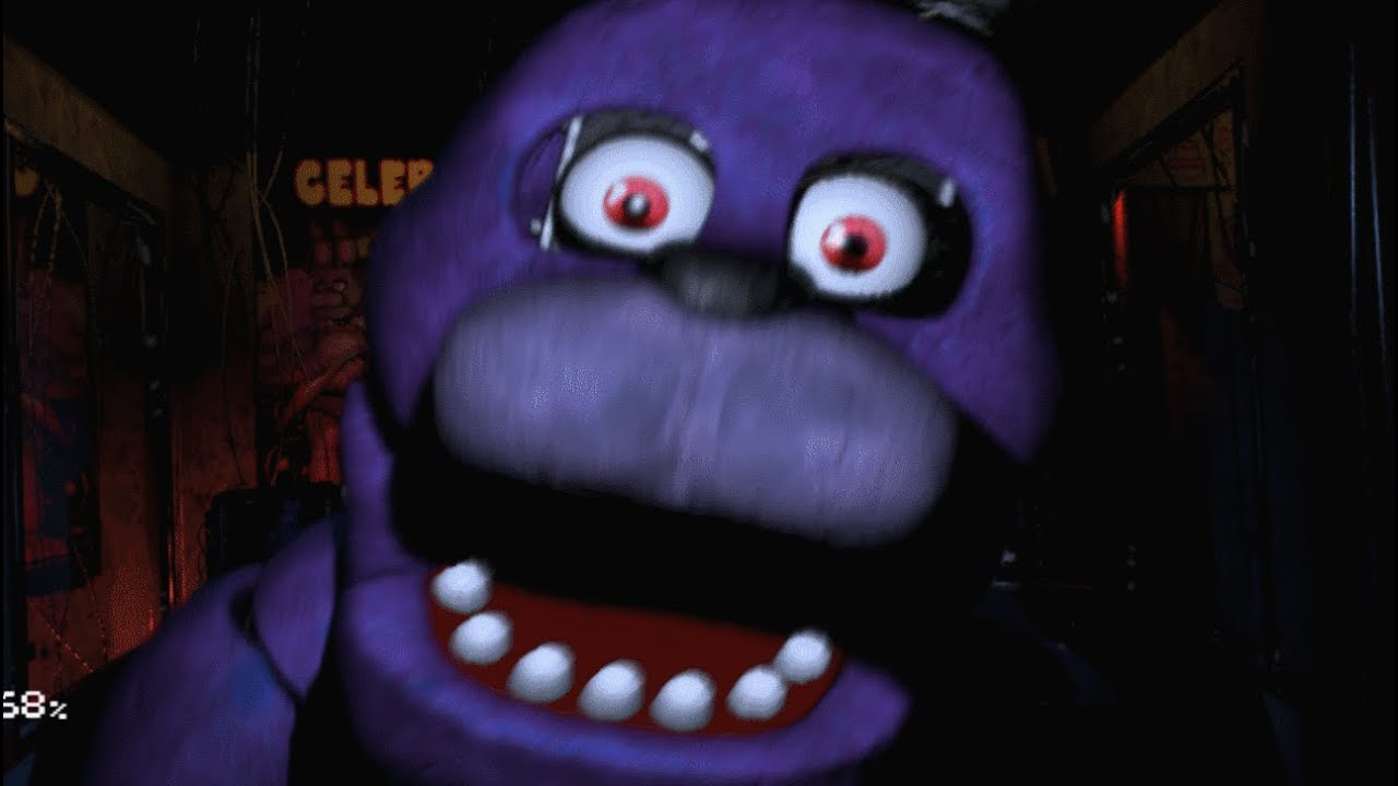
Games night new render
Monday, 3 April 2017
Evaluation question 4
How did you use media technologies in the construction and research, planning and evaluation stages?
Using lots of different media technologies when creating my research and planning was very helpful as different means of presentation were much more free and expansive. For instance, using slideshare to present my media equipment powerpoint is a lot more interactive and user-friendly than a link to a page with the powerpoint on it. This not only makes the blog look a lot nicer and cleaner, but allows the user to stay on the page with an easy experience where they can simply flick through the information and read it as they go.
A lot of the outlets used were also a lot more creator-friendly than simply pasting it into blogger. Another site I used whilst creating my research and planning part of the project was Text2Mindmap which helped get my ideas down on the page a lot faster and more efficiently than a simply text document. A mindmap instantly sorts and categorizes the information you put in which makes the process a lot quicker than manually typing up the difference sections and putting the details under it. The site is also colour-coded so myself and users can see which information belongs to which subheading with absolute ease. The entire system just allows for more creative freedom where I could get my ideas down quickly in a way that is easy for the audience to understand as well as myself when creating it and coming back to it later in the project.
I have also used piktogram to display one of my evaluation questions which was extremely helpful as it allowed me to structure my different points in a sophisticated way. I was able to do this with titles that explain the section as well as a picture to accompany the information. This makes reading the response lot easier and less messy than just posting it as text on the blog.
To film my product I used lots of different equipment and technology. The camera I used was a Nikon DSLR D3200. I used this camera as it was very easy to work with and it allowed me to produce high quality shots in high resolution. They have extensive features that give a huge range of different shots. As an example, the user can change the FPS, the video quality, the ISO, aperture and shutter speed. This allows for lots of different effects that wouldn't be possible on a normal video camera.
Along with the D3200 I also used multiple lenses which increased the quality of the shots tremendously. I used a prime lens which allowed me to get very nice shots with pull focuses on the character and the background behind him as well as a regular zoom lens which generally increased the versatility of the camera.
To stabilize the D3200 I used a camera stabilizer which allowed me to capture very nice steady shots as opposed to shaking the camera with my hands, and when I wanted still shots I used a regular 3-legged tripod which was obviously very helpful in the woods where it was hard to get steady shots.
I used a blue morph suit in order to get very unique effects in the video. I used the blue suit to move around things in the scene which would later be chroma keyed out revealing the background, giving the impression of the monkey seemingly moving by itself. This is quite an abstract piece of equipment to use but it meant I could get really unique and weird effects.
To edit the video I used two different programmes. Firstly, I used Final Cut Pro to put my clips into decide on how to structure the video with music, text and the order of the clips. Final cut was very good for this as it's a very simple interface and it's easy to work with so simply adding these clips and viewing them afterwards to see if it worked was a fast process.
After using Final cut I also used Sony Vegas Pro 10, which has lots more advanced filters and effects that added to the overall feel of my final product. I'm far more advanced in using Sony Vegas so creating my final product in this programme was the best decision for my product. Specifically, sony vegas allowed me to stabilize my clips, add colour corrections in a sophisticated way and add film grain which could be animated to add to the "olden" feel in the black and white clips.

Evaluation question 1
In what way does your media product use, develop or challenge forms and conventions of real media products?
https://magic.piktochart.com/output/21519801-evaluation-question-1
https://magic.piktochart.com/output/21519801-evaluation-question-1
Evaluation question 2
How effective is the combination of your main product and ancillary texts?

When creating all 3 of my products including my short film, movie poster and magazine review I kept the house style in mind and tried not to deviate from it. This is to create a branding for the product. A recognizable theme and art style that an audience can view and know instantly that it is my product. I used the same font throughout the entirety of the project which represents a classical horror film or the horror genre itself as well as a very over-the-top filter/art style for the characters in the poster. This is very unconventional in films nowadays due to the fact that most posters just contain an image of the antagonist or protagonist doing a certain thing with no artistic approach or uniqueness.
The classical horror theme continues throughout the project and is heavily emphasized in the short film itself. I used the classic "horror organ music" associated with classic horrors like Frankenstein and Dracula which will be recognized by a huge amount of demographics and audiences. I used this for comedic effect as well as a way to reach the audience on a level that they might not realize, due to the music being easily recognizable but not very popular in modern media.
 I also used the same colour scheme throughout all 3 pieces of media, with a dark underlying tone and heavy bright red text. Though this also relates to the classical horror films that would use a similar colour scheme (due to the fact that there were no screens in colour) I did this because a recognizable colour scheme is very important when forming a brand around a product. The bright red used in the text is also very over-the-top and will be heavily associated with my product after a consumer sees it. Again, this effect is good because a unique style makes all things associated
with the product easier to spot.

Main project video
NOT THE RESOLUTION THE VIDEO WAS MADE IN, THE RENDERING MADE THE VIDEO LOOK LIKE THIS
Friday, 17 February 2017
Horror film cliches
To create a parody of a horror, I first need to identify the clichés and common conventions of the films so they can be made fun of. I'm going to look at some of the most popular conventional horror films from the past few years and some of the iconic scenes from large horrors that will definitely be known by the target audience.
I found a lot of these when analysing existing short films, and this helped me further my knowledge of conventions in the horror genre and use them to my advantage.
Unaware character:
 Jumpscare:

Dumb main character:
I found a lot of these when analysing existing short films, and this helped me further my knowledge of conventions in the horror genre and use them to my advantage.
A technique that is often used in many horror films is making the main character unaware of an obvious threat behind them or around them. A very common way of doing this is by using a rotating bathroom mirror or reflection, showing the antagonist behind them or around them making the audience want to do something about it.


Another very common element of horror films is the jumpscare. Setting up a scene to be very quiet or atmospheric with the climax being a loud, abrupt sound and scary imagery.

Dumb main character:
The main character of a horror film usually does very questionable and dangerous things for seemingly no reason. This has become somewhat of a joke in popular media. For instance, when running away from the antagonist the character might trip over or something over-the-top while they are walking towards them.


Character profile: Antagonist (orangutang)

The monkey doesn't necessarily have a personality, just more of a stereotypical antagonistic and scary presence in the film. This is an intentional effect and not an underdeveloped or non-important character that is in the film.
Character profile: Protagonist

Name: Zach (unknown from the film itself)
Age:17 (teenager)
Personality traits: Goofy, dimwitted, wimpy, innocent
Interests: music, schoolwork
I want the entire production to be quite enigmatic, including the characters. The video will contain very little dialogue for obvious reasons (there is only one character that can talk) and this will be quite a strong theme throughout. Even the starting scene will show the character walking down a pathway towards the camera leading the audience to think about who this person is, why he is walking, what is significant about the character?
Thursday, 2 February 2017


Wednesday, 25 January 2017
Film company logos

Typography examples

I have edited my chosen typography into multiple different styles and colours that will be helpful when I'm creating my titling sequence for the short film. I will probably go with a green one because this is quite a prominent colour in horror films with connotations of alien goo and this also relates to the gaming themes associated with the short film
Typography survey
I surveyed 15 people from my target audience (16-24 yr olds primarily male) to see which font would best suit my style of short film. Within the sample there were 9 males and 6 females all aged 16-24, and one font had quite a high majority of the votes.
The font itself looks like a cheesy 80's horror film so this would fit a parody quite well. I will now get on with editing the font into a suitable picture for my main project, so I can add it at the start of my production.

The font itself looks like a cheesy 80's horror film so this would fit a parody quite well. I will now get on with editing the font into a suitable picture for my main project, so I can add it at the start of my production.

Subscribe to:
Posts (Atom)